- Marketing Shots
- Posts
- The Power of the Dash: How KitKat Claimed the Space Between
The Power of the Dash: How KitKat Claimed the Space Between
Visual Minimalism
Hello, awesome marketers and founders.
This is Luv, and here’s your weekly Marketing Shot :)
A big thank you and welcome to the people who have recently subscribed.
HubSpot's ex-Head of Paid shares his 2026 playbook
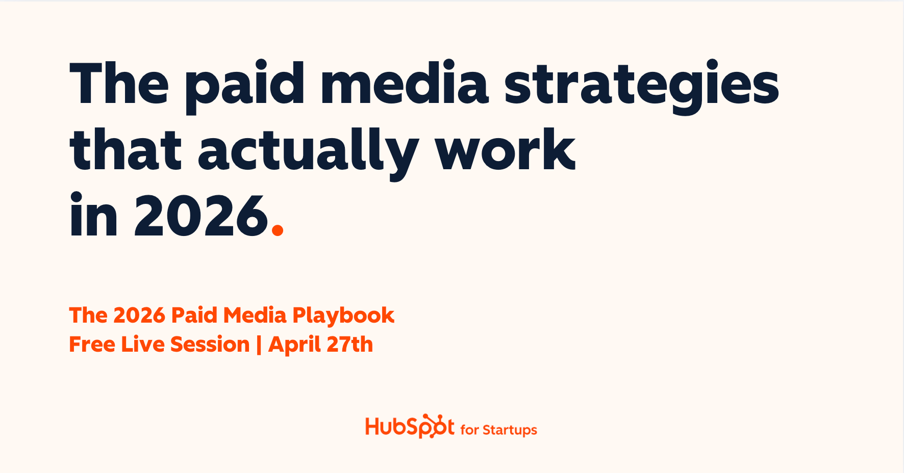
Rex Gelb spent a decade building HubSpot's paid engine. Now he's showing founders exactly how to do it.
On April 27th, get the framework to structure, launch, and scale paid media that drives pipeline, not just traffic. 20 minutes. Live Q&A. Free.
In the marketing world, we often try to scream the loudest to get noticed. But KitKat Canada just did something incredibly clever by doing the exact opposite. They did not add more noise.
Instead, they simply looked at the space between things and claimed it.
They took the (-) dash, we see a thousand times a day and replaced it with a KitKat bar.
Visual Minimalism
The execution was brilliant. On massive red billboards, they featured familiar pairs like 9-5, YYZ-JFK and Departure-Arrival. Right in the middle, where the hyphen should be, sat a single KitKat bar.


It was a subtle and almost silent prompt. It reminded that the transition between two tasks or two places is exactly where a break belongs.
They just used a bit of punctuation that has been hiding in plain sight for decades.
Real-World Ads, Simple to Run

With AdQuick, executing Out Of Home campaigns is as easy as running digital ads. Plan, deploy, and measure your real-world advertising effortlessly — so your team can scale campaigns and maximize impact without the headaches.
Did you enjoy today's Marketing Shot? ☺️ |
That's a wrap for today! Stay tuned for the next edition.
Thanks,
Luv
This newsletter runs on Beehiiv. If you plan to start your newsletter, use this link to get your FREE 30-Day Trial + 20% OFF for First 3 Months.